
Design and publishing
TikTok Slideshow Text Cut Off? How to Fix Your Layout
Fix cropped or overlapping TikTok slideshow text. Compare real exports, check your margins, and follow a practical checklist before posting.
By ReelMoney · Updated · 5 min read
If your TikTok slideshow text is cut off, open the downloaded slide before changing the design. Text missing from that file points to an export or layout problem. Text that is complete in the file but hidden in the feed needs more space around the caption and interface. If two text blocks overlap in both places, fix their spacing first.
Work through the symptom table below, then compare the original exports. You can apply the same checks in ReelMoney or another slideshow editor.
Find where the problem starts
| What you see | What to check | First change to try |
|---|---|---|
| Letters are missing in the downloaded image | The text box extends beyond the canvas, or the export differs from the editor | Move the text inward and compare a fresh export with the editor |
| The file looks complete, but the feed hides part of it | The caption, action buttons, or displayed crop covers essential content | Move that content higher or farther from the sides |
| A subtitle touches the headline | The headline wraps onto more lines than its text box allows | Increase the gap or move supporting words to another slide |
| The exported font wraps differently | The same font family, weight, and text box width are available during export | Choose a supported font and export the same slide again |
| Everything looks small or soft | A screenshot or repeatedly compressed image was uploaded | Use the original export and check it at normal phone size |
Start with one affected slide. Change one thing, export it again, and compare the result. This makes it easier to tell whether the issue is placement, wrapping, or the image itself.
Compare the same text before and after fitting
These are original images exported with the ReelMoney renderer. They use identical wording and fonts on a plain background so you can inspect the text clearly. They are a controlled layout demonstration, not screenshots of a TikTok post.
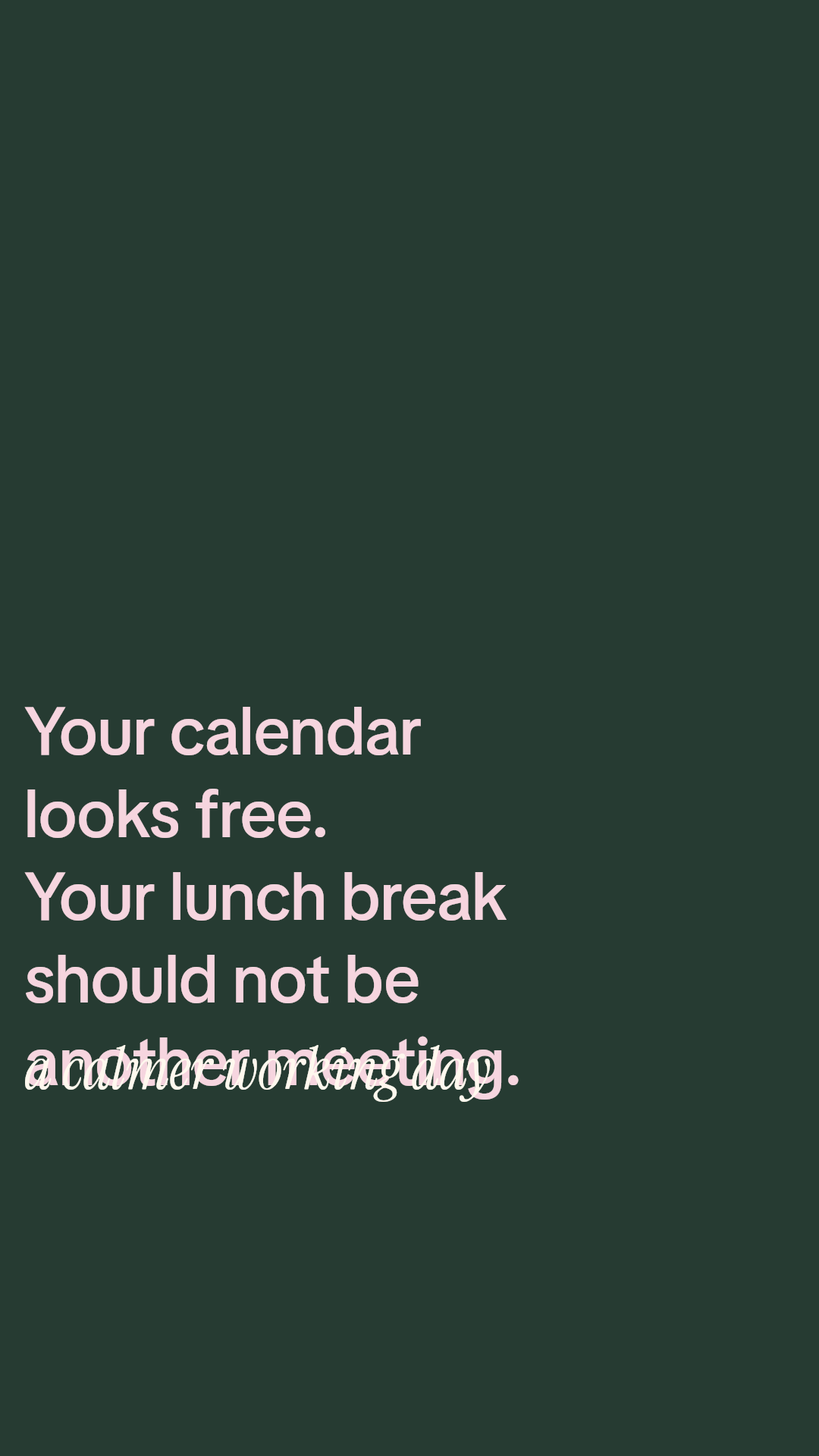
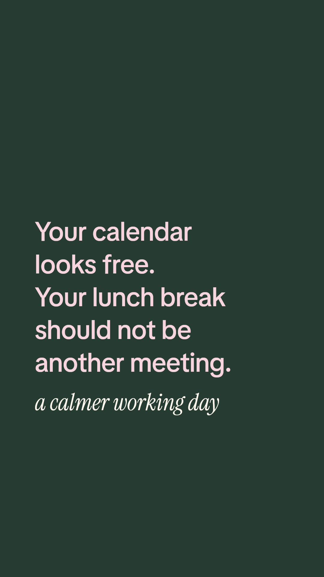
The lesson: font size alone does not determine whether a slide fits. Text box width changes the number of lines, and those lines determine where the subtitle can start. Moving a subtitle down by eye may simply move it into the area covered by the caption.
Use margins as a starting layout
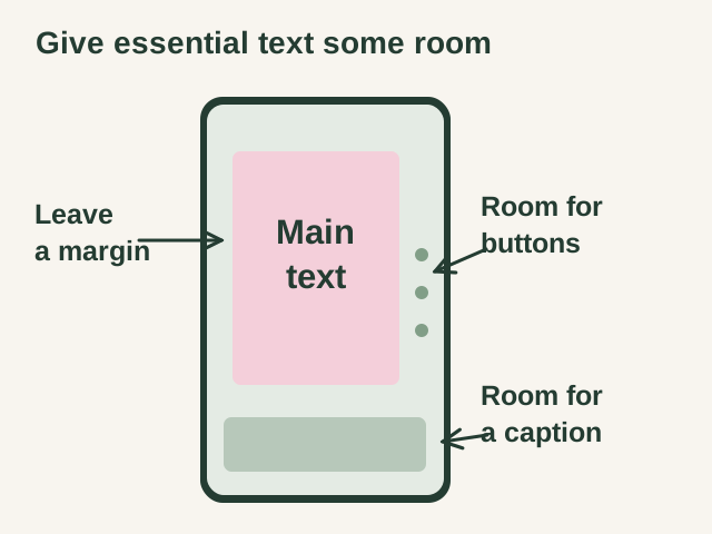
A 1080 by 1920 pixel canvas is a useful starting point for a portrait slide. For the fitted example, the text starts 108 pixels from the left edge and occupies 756 pixels of width. This leaves 216 pixels on the right. The complete text stack stays between roughly 230 and 1382 pixels from the top.
Those numbers describe this example. They are not an official universal TikTok safe area. A different aspect ratio, a longer caption, or a different viewing screen can change what remains visible.
TikTok's safe zone guidance for download card ads explains that interface elements and caption length affect placement in that advertising format. For your organic photo slideshow, inspect the actual feed view and move essential content away from anything covering it.
Keep the main claim, the product detail, and the next action inside the area you have checked. A decorative part of a background photo can tolerate a crop more easily than the first word of your headline.
Fix spacing before shrinking the type
- Shorten the opening. Remove setup the next slide can explain. “Set booking hours around your lunch break” needs less room than a paragraph introducing every scheduling feature.
- Check the actual line breaks. A narrow box can turn one phrase into three lines. Preview it with the font and weight you intend to export.
- Give the subtitle its own space. Start it below the visible end of the headline, including any outline. Do not position it using the headline's first line alone.
- Move the complete group upward. Check the top edge too, and leave the opening easy to read.
- Reduce font size only as needed. If the slide becomes difficult to read on a phone, divide the message across two slides.
For writing help, use the slideshow hook examples. A concise promise gives the design more room while keeping the reader's reason to swipe clear.
Check these things before posting
- The first and last letters of every line are visible in the downloaded image.
- The longest headline and densest paragraph are readable without zooming.
- The subtitle and any outline have clear space around them.
- The product screenshot shows the specific detail the text describes.
- The final slide leaves room for the caption and action buttons.
- The export uses the intended aspect ratio and matches the editor's wrapping.
- The publishing flow uses the photo or video format you intended.
- You have checked the final post on a phone before repeating the layout across a batch.
Common questions
Will changing the caption fix overlapping text?
A shorter caption may uncover content in the feed. It cannot separate two text blocks that already overlap inside the uploaded image. Correct that image in the editor and inspect a new export.
Should I use smaller text on every slide?
Check the crowded slides first. A short title may already fit well. Keep the overall visual style consistent, but give longer explanations enough space or another slide instead of shrinking the entire slideshow.
Does a clear editor preview guarantee a clear TikTok post?
The editor shows the design canvas. The final post also has a viewing layout and interface around it. Review both the exported file and the posted result, especially when trying a new font, layout, or aspect ratio.
For the full workflow, read how to make a TikTok slideshow for your business. To create and review a complete sequence, explore the ReelMoney carousel maker.